FlexDoc/XML - DiagramKit - FAQ

Component Properties
What are properties?
Properties are the items of extra information about element/attribute components declared in the XML schema (such as the element/attribute type, content, facets, default value etc.) that can be shown in the XSD diagrams along with the element/attribute names, annotations and a few other things represented mostly with the graphics means.Properties are displayed in a little grid embedded in the diagram node that depicts the given element or attribute component. Each property grid row may show one or two properties. Correspondingly, it consists of two or three cells:
- The row title in the left column
- Followed by one or two cells with property values.
| Element/Attribute Name | ||
| prop1 | value 1 | |
| prop2/prop3 | value 2 | value 3 |
| prop4 | value 4 | |
| prop5/prop6 | value 5 | value 6 |
| ... | ... | |
How to enable/disable properties?
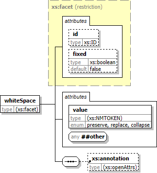
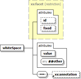
The displaying of properties is controlled by the template parameter: If this parameter is selected (true) the properties are generated (left screenshot). Otherwise no properties are generated (right screenshot).
 |
 |
How to specify properties?
The generation of properties is controlled by these template parameters:[x] indicates the boolean parameters, which allow you to enable/disable displaying either all properties or only those of elements/attributes.
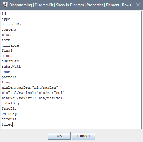
Each «Rows» parameter defines which properties are generated for elements and attributes respectively. The default values of «Rows» parameters specify all properties currently available (both in the case of elements and attributes). If you look at those values, you will see a text like this:

Specifying single-property row
A single-property row is defined as follows:propName- or
propName:"Title"
'propName' is a name identifying the property. Effectively, it is the name of certain function that produces the property value.
'Title' is a string that will be used as the property row title. It may contain spaces. However, it must be enclosed in double quotes.
The title is optional. When not specified, the 'propName' will be used as title.
Specifying double-property row
A double-property row is defined as follows:propName1/propName2- or
propName1/propName2:"Title"
'propName1', 'propName2' are the names identifying the properties.
When the title is not specified, it will be generated from both property names separated with the slash.
Default row specifications
The default values of «Rows» parameters:- DiagramKit | Show in Diagram | Properties | Element | Rows
- DiagramKit | Show in Diagram | Properties | Attribute | Rows
To specify only properties you need, you may start by using the default values of «Rows» parameters and remove from them those lines you don't need.
How to control displaying of properties?
This section explains some aspects of how properties are displayed and how to customize that.Controlling grid width
Since property grid may potentially stretch to any width, the following parameter allows you to limit that: Using it, you can specify the maximal width of the whole diagram node in pixels. That will limit also the width of the property grid embedded in the node. The property values that do not fit into the grid cell will be clipped, which is indicated by the ellipsis added at the end of the visible value text.Widths of value columns
The first and the second value cells of double-property rows form respectively two value columns across the whole grid. By default, the widths of those columns are equalized so as to makes the grid look symmetric and easier to read, e.g.:

In that case, you may disable the equalizing the widths of value columns by unselecting the parameter:
The effect of this parameter can be seen on the following screenshots showing the same element node. The one on the left has been generated with
«Equal Column Widths» parameter selected (true).
On the right is the one generated with this parameter unselected (false). Obviously the later variant looks better:
 |
 |
Properties with list value
Some properties may have not a single but several values associated with them (e.g.enum, pattern).
In that case, the text shown in the corresponding value cell will be formed from the actual value items separated with some separator.
By default, that separator is a space character (' ').
However, for some properties it specified with a parameter in the group:
When property has no value
When a property specified in the definition of a property row has no value for a given element/attribute component, that property will be ignored. When the row contains no other property with a definite value, that row will be skipped.What properties are available?
All currently supported properties are described in the table below. Here is their alphabetic list:|
block content default derivedBy enum final fixed form fracDig |
id length maxExcl maxIncl maxLen minExcl minIncl minLen |
mixed nillable pattern substGrp substWith totalDig type whiteSp |
Note that some properties are applicable to all components, others – only to elements or attributes (as well as only to global or local ones).
| propName | Description | Applies to Elements |
Applies to Attributes |
|---|---|---|---|
id
|
Shows the value of 'id' attribute specified on the
<xs:element> / <xs:attribute>
component.
When no
When, this is a reference to a global element/attribute, first the |
 |
 |
form
|
Shows the value of 'form' attribute specified on the local
<xs:element> / <xs:attribute>
component.
When no |
 |
 |
use
|
Shows the value of 'use' attribute specified on the local <xs:attribute> component or reference.
When no |
 |
|
type
|
Shows the qualified name of the type of the element/attribute, e.g.
'|' and enclosed in round brackets, e.g.
'anonymous'.
In addition to the textual representation of the type, the property value shown in the grid will be hyperlinked to the details of that type found in the generated documentation or to its definition within the XML schema source. |
 |
 |
derivedBy
|
This property has a defined value, when the element/attribute type is anonymous one, at that derived from one or more named types.
The property shows the derivation method, which may be one of the following:
|
 |
 |
content
|
Shows the kind of the element content, which may be one of the following:
|
 |
|
default
|
Shows the default value of an element (with simple content) or attribute:
'default' attribute found, the property has no value.
|
 |
 |
fixed
|
Shows the fixed value of an element (with simple content) or attribute:
'fixed' attribute found, the property has no value.
|
 |
 |
nillable
|
Shows the value of 'nillable' attribute specified on the global or local element component.
In the case of reference to a global element, the property shows the value of
When no |
 |
|
final
|
Shows the value of 'final' attribute specified on the global or local element component.
In the case of reference to a global element, the property shows the value of
When no |
 |
|
block
|
Shows the value of 'block' attribute specified on the global or local element component.
In the case of reference to a global element, the property shows the value of
When no |
 |
|
substGrp
|
Shows the value of 'substitutionGroup' attribute specified on the global element component.
In the case of reference to a global element, the property shows the value of
When the reference specified with the
When no See Also: |
 |
|
substWith
|
This property is applicable only to global element components or references to them.
When the element is the head of a substitution group, this property shows the total number of other elements this element can be substituted with, e.g.:
Typically, all of those elements are the member of the substitution group headed by the given element. However, that's not always the case. Some of those members may be abstract elements heading their own substitution groups and so on. That everything will form a multilevel substitution group, all non-abstract members of which can substitute the top head element. It is the total number of them, what this property shows (to give an idea of their quantity, since the detailed list cannot fit in a property cell anyway). Additionally, the property value shown in the grid will be hyperlinked to the full list of the substituting element generated in the given element's details. The first 20 elements of that list will be visible also in the hyperlink's tooltip.When the given element component is not a substitution group head, this property has no value. This property may be particularly useful, when showing of substitution groups in diagrams (controlled by «DiagramKit | Show in Diagram | Substitution Groups» parameter) is fully or partially disabled, for instance, because the substitution groups are too large or there are too many of them, so the diagrams containing those substitution groups get bloated to unmanageable size. See Also: |
 |
|
enum
|
Shows the values of all enumeration facets specified for the type of the element/attribute.
The value separator can be customized with the parameter: DiagramKit | Show in Diagram | Properties | Values | List Separator | Enumeration Additionally, the property value cell in the grid will be hyperlinked to the enumeration details found in the documentation, which may contain also the descriptions of particular items. When the type has no enumeration facets, this property has no value. |
 |
 |
pattern
|
Shows the values of all pattern facets specified for the type of the element/attribute.
The value separator can be customized with the parameter: DiagramKit | Show in Diagram | Properties | Values | List Separator | Pattern Additionally, the property value cell in the grid will be hyperlinked to the pattern details found in the documentation, where the full pattern string(s) can be seen (which may not fit in the property grid cell on the diagram). When the type has no pattern facets, this property has no value. |
 |
 |
length
|
Shows the value of length facet specified for the type of the element/attribute.
|
 |
 |
minLen, maxLen
|
Shows the value of minLength / maxLength facet specified for the type of the element/attribute.
|
 |
 |
minIncl, maxIncl
|
Shows the value of minInclusive / maxInclusive facet specified for the type of the element/attribute.
|
 |
 |
minExcl, maxExcl
|
Shows the value of minExclusive / maxExclusive facet specified for the type of the element/attribute.
|
 |
 |
totalDig, fracDig
|
Shows the value of totalDigits / fractionalDigits facet specified for the type of the element/attribute.
|
 |
 |
whiteSp
|
Shows the value of whiteSpace facet specified for the type of the element/attribute.
|
 |
 |
